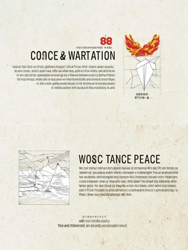
一、核心元素融合:历史与未来的视觉对话
 Midjourney Bot
更新时间:2025-05-25
00:06:26
Midjourney Bot
更新时间:2025-05-25
00:06:26提示词:https://images.gogpt.vip/aigf/m_origin/20250524/1583994/fpwmieom595x1r3d.jpg 1、 Core element fusion: Visual dialogue between history and the future Historical memory layer (left/upper part): Incorporating elements of anti Japanese war scenes (such as old photo style battlefields, brave soldiers, worn-out weapons, and burning beacon towers), presented in black and white tones or yellowed textures, symbolizing the weight and suffering of history. Overlaying the outline of the Great Wall (identifying core elements) strengthens the spirit of "the whole nation united in the war", interweaving the lines of the Great Wall with the scenes of the war, such as the Great Wall winding through the battlefield, symbolizing the resilient support of the national spirit. Future Outlook Layer (Right/Lower Part): Showcasing modern peace scenes (such as prosperous cities, technological innovation, ecological nature, and people's smiling faces), expressed in bright colors (red, gold, green), symbolizing development and hope after victory. Incorporating olive branches and radiance (identifying elements), olive branches surround modern scenes, while radiance (such as golden radiance and the outline of the Victory Gate) extends from the historical level to the future, symbolizing "winning peace with victory and creating a bright future". Marking finishing touch: The number "80" and the time "1945-2025" are placed in the center or visual focus of the picture, highlighted with metallic texture or dazzling special effects, to enhance the timeliness and solemnity of the commemorative theme. 2、 Visual Narrative: Time and Space Transition from Suffering to Brilliance Composition Logic: Adopting a "V"- shaped composition (symbol of victory), the historical scene on the left presents a sense of sinking and oppression (such as a battlefield filled with smoke), while the future scene on the right presents a sense of rising and stretching (such as a city under the rising sun). The middle is formed by the Great Wall and radiance, connecting the past and the future, symbolizing "from victory in the War of Resistance Against Japan to national rejuvenation". Detail enhancement: Historical section: Add elements such as bullet holes, ruins, and martyr monuments to convey the cruelty of war and the necessity of remembering history. Future section: Incorporating peace doves, seedlings (symbolizing hope), and technological symbols (such as chips and satellites) to embody the technology and peaceful development of "creating the future". 3、 Color symbol: contrast between heaviness and hope. Historical area color: mainly dark gray, ochre, black, with a small amount of dark red (symbolizing blood sacrifice), creating a deep and solemn atmosphere, evoking reverence for history. Future district colors: mainly gold (radiance), bright red (fighting spirit), and emerald green (vitality), supplemented by bright blue (technological sense), showcasing the vitality and hope of the new era. Identification colors: Great Wall (dark brown/gray), olive branch (emerald green), radiance (gold), number "80" (bright red+gold gradient), ensuring that the identification elements are eye-catching and coordinated in the picture, meeting the requirements of "serious and solemn" use. 4、 Layout and Text: The theme is distinct and the hierarchy is clear. Text Layout: The main title "Remembering History and Creating the Future" adopts bold calligraphy fonts (such as Wei Bei and Cuan), placed above or in the center of the picture, combined with identification elements (such as Radiance and Victory Gate) to enhance visual impact. The subtitle "Commemorating the 80th Anniversary of the Victory of the Chinese People's War of Resistance against Japanese Aggression and the World Anti Fascist War" is located below the main title in simple sans serif font, highlighting the formality of the theme. Auxiliary texts (such as slogans like "Justice will win, peace will win, and the people will win") can be embellished in historical and future scenes to strengthen spiritual connotations. Logo usage: Strictly follow the official logo usage guidelines: do not modify, deform, or use for commercial purposes. Use the logo as the core visual symbol, organically integrate it with the theme text and scene elements, and ensure that the overall style is serious, dignified, and infectious. 5、 Version Expansion (Multi Style Presentation) Historical Thick Edition: Based on black and white documentary screenshots of the Anti Japanese War, overlaid with the golden Great Wall and olive branches, the text uses a hot stamping effect to highlight the profound sense of "remembering history". Future Hope Edition: Set against the backdrop of a modern city skyline, incorporating transparent textures of the Great Wall and radiance, with olive branches surrounding the number "80" and bright colors, emphasizing the vitality of "creating the future". International Perspective Version: Incorporating elements of the world anti fascist battlefield (such as the Soviet Red Army and Allied flags), the olive branch connects global peace scenes, reflecting the international significance of the "victory of the world anti fascist war". The text is presented in both Chinese and English. Youth interactive version: designed as a removable poster, with a reserved "Youth Oath" writing area at the bottom (such as "We should strive for self-improvement"), combined with QR code links to historical materials of the Anti Japanese War, to enhance the participation of young people. The summary of design principles closely follows the theme: interpreting the dialectical relationship between "remembering" and "creating" through visual comparison between history and the future. Standardize the use of signage: Ensure the seriousness and integrity of commemorative event signage, and strengthen the authority of official themes. Emotional resonance: Using color, composition, and details to evoke the audience's reverence for history, appreciation for peace, and confidence in the future. Through the above design, the poster can not only highlight the historical significance of the victory of the Anti Japanese War, but also convey the mission of "creating the future" in the new era, which meets the theme and visual communication needs of commemorative activities. Minimalism, Post Minimalism, Modernism, Futurism, African Futurism, Abstract Expressionism, Peter Mondrian, --ar 3:4 --v 7 --c 76 --weird 448 --stylize 100 --sref https://images.gogpt.vip/aigf/m_origin/20250524/1583994/fpwmieom595x1r3d.jpg --oref https://images.gogpt.vip/aigf/m_origin/20250524/1583994/fpwmieom595x1r3d.jpg --ow 400 --sw 703

素材来源:Midjourney中文版
Copyright©2017 Midjourney9.com All Right
Reserved 版权所有:成都金翼云科技有限公司 蜀ICP备2023008999号